Understanding Charting in Family Tree Maker 2011
By Geoffrey Slinker
Copyright Geoffrey Slinker 2015
Please share the link to this tutorial but do not copy the contents. The contents of this blog post are the property of the author and copying the contents is forbidden.
I do not provide support for Family Tree Maker. I will not respond to emails or comments. This information's sole purpose is to be informative and makes no claims to the accuracy of this information with the current version of Family Tree Maker.
Introduction
Charting in Family Tree Maker is a very essential aspect and set of features that are required for most genealogical software products. Since I developed the software I have a good understanding of the abilities of FTM charting. This tutorial is not to justify how FTM charting functions. There are different ways to layout charts and usually there are errors in software. I will describe how to use charting and describe the reasons for various behaviors in charting.
The Publish Module
At the top of the FTM application window is a list of buttons. These buttons take you to the various modules in FTM. By clicking the “Publish” button the application goes into the Publish Module.
Below the module buttons are the application menus and the “Mini Nav”. The Mini Nav is a small person navigator.
The highlighted person in the Mini Nav (the person control) will be the root person of any chart.
Publish Collection
The Publish Module has two tabs, the Collection Tab and the Detail Tab. After FTM startup the first time you enter the Publication Module the Collection Tab will be selected.
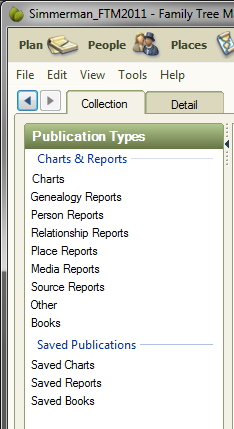
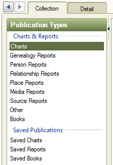
Collection View
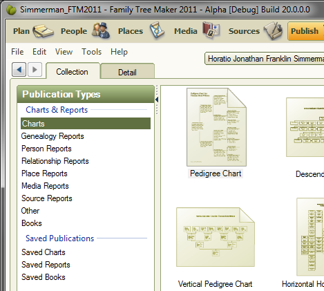
On the left side of the Publish Module’s Collection View is the Publication Types List.
In this tutorial “Charts” and “Saved Charts” are the two types that will be covered.
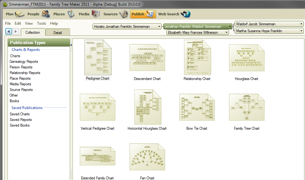
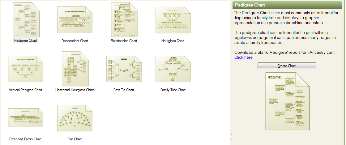
With “Charts” selected in the Publication Type List the center panel displays the types of charts that can be created.
By clicking once on any of the chart types the right panel will show a description of the chart in the left panel.
Chart Types
The Relationship Chart is not technically a chart; it is a report.
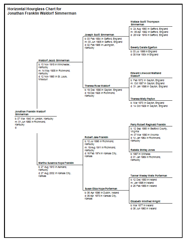
Many of the chart types are just special cases of another chart type. The Pedigree Chart and the Horizontal Hourglass chart share much of the same functionality and behavior. The Bow Tie Chart is also shares functionality and behavior with the Horizontal Hourglass Chart.
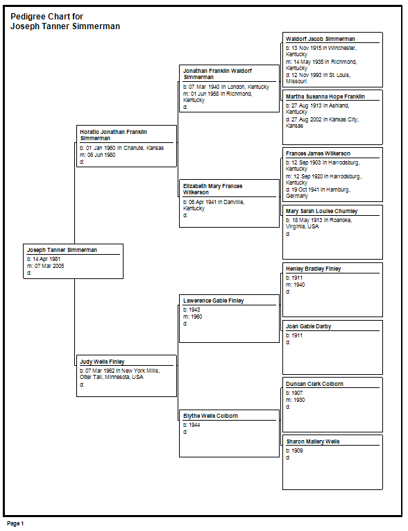
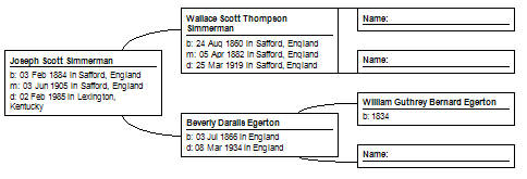
You can change the options on a Horizontal Hourglass Chart to make pedigree styled charts. In the following example I first went into a Pedigree Chart and saved the options as a template. Then I opened a Horizontal Hourglass Chart and applied the template. The result is a chart identical to a Pedigree Chart.
A Horizontal Hourglass Chart has more options than a Pedigree Chart except that a Pedigree Chart can have a “Book” layout and the Horizontal Hourglass Chart only has “Poster” layout.
The following example I changed the “Box Border and Line Options” so that each node in the chart has a border, I included “spouses of the primary individual” and “siblings of the primary individual”, and I changed the “Overlap” to be “Fish Tail”.
These settings produce a nice pedigree-like chart that has the siblings and spouses of the primary individual. The primary individual is the root node of the chart and is the person selected in the Mini Nav.
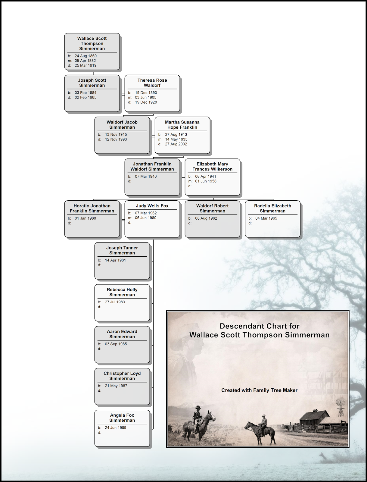
The Hourglass Chart is the basis for the Descendant Chart and the Vertical Pedigree Chart. In the Hourglass Chart setting the Descendant generations to zero will make the equivalent of the Vertical Pedigree Chart. Setting the Hourglass Chart’s Ancestor generations to zero will make the equivalent to the Descendant Chart.
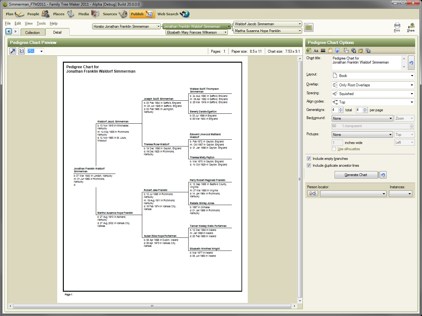
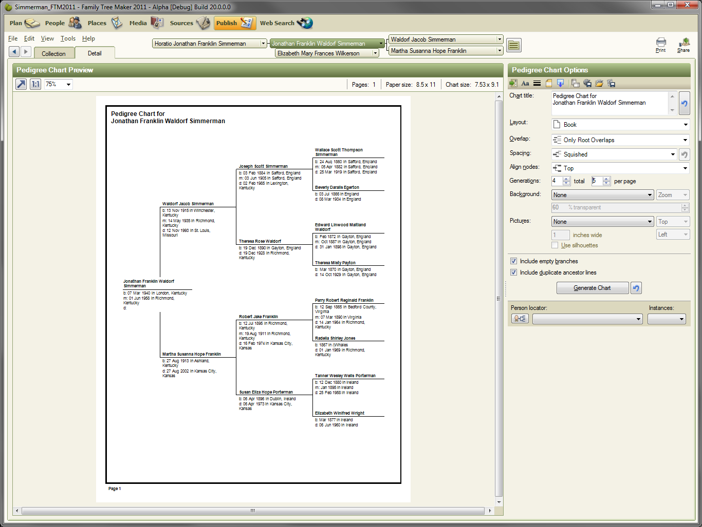
Detail View
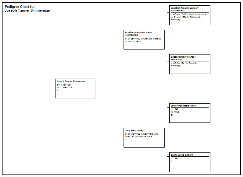
Click once and select the Pedigree Chart.
Then click the “Detail” tab just above the Pedigree Chart icon. This will create a new Pedigree Chart and go to the Detail View. You can also double click the Pedigree Chart Icon or click the “Create Chart” button in the right panel.
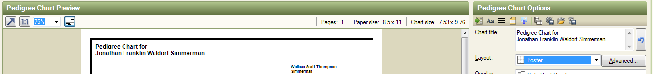
In the Detail View the main area is known as the Preview Panel. The Preview Panel shows the chart. The Chart Options panel is found on the right and contains controls to modify the chart and to save the chart.
Preview Panel
In the Preview Panel there are controls to change the view and to give general information about the chart.
 This button will change the zoom of the panel so that the entire chart is visible. If the chart is extremely large the value of zoom will be 10% and the chart may not be entirely visible. The 10% limit exists in case the chart uses many pages (sometimes charts are thousands of pages) so that FTM does not draw the entire chart because it could take a long time.
 This button will set the zoom back to 100%.
 This control allows you to change the zoom. You can type values directly into the control as well. The range is 1% up to 1000%.
If the chart options are changed from “Book” layout to “Poster” layout an additional button is available.
 This button changes the preview so that page breaks are shown are not. This is called “Show page breaks”. When page breaks are not shown it is known as a continuous view. The button is only available for “Poster” layouts.
Below is an example of a chart with page breaks visible.
Following is the same chart after clicking the page break button and switching to the continuous view.
Visually the chart may look better if the page breaks are not shown. Note that while the preview is in this “continuous” non-page break mode that the ability to print a specific page through the pop-up menus is not available.
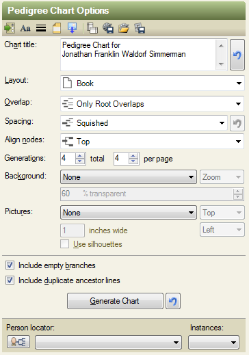
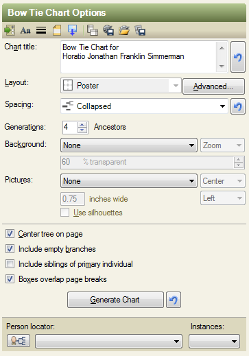
Options Panel
Above shows the right panel of the Detail View of the Publish Module. The screen shot shows the default settings for a Pedigree Chart for FTM 2011.
The top of the Options Panel has a series of buttons that open dialogs.
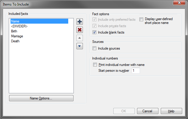
 This button opens the “Items to include” dialog.
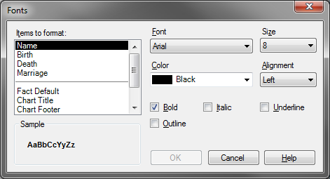
 This Button opens the Fonts dialog.
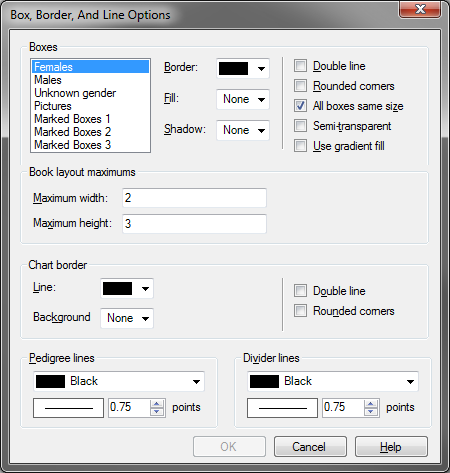
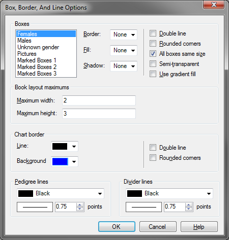
 This button opens the “Box Border and Line Options” dialog.
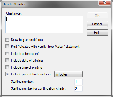
 This button opens the Header Footer dialog.
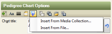
 This button (new to FTM 2011) opens a menu to select images to include in the chart.
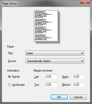
 This button opens the Page Setup dialog.
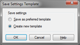
 This button opens the Save Settings Template dialog.
 This button opens the Use Settings Template dialog.
 This button opens the Save Chart dialog.
Below the series of buttons are chart specific options. The following image shows the default options for the Pedigree Chart.
Since each chart has specific options the details of these options will be described on a per chart type basis.
The Chart Types
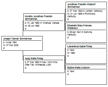
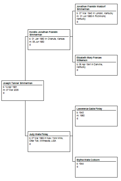
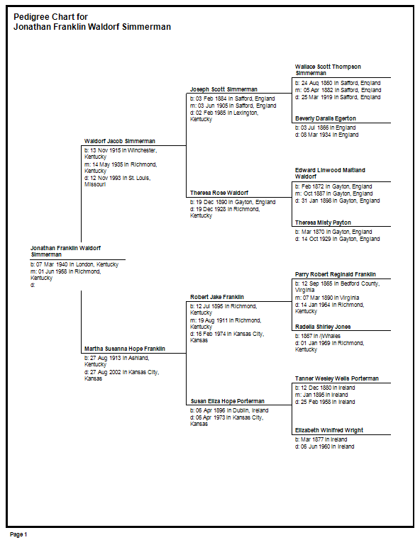
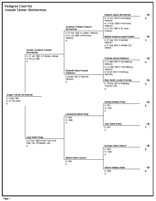
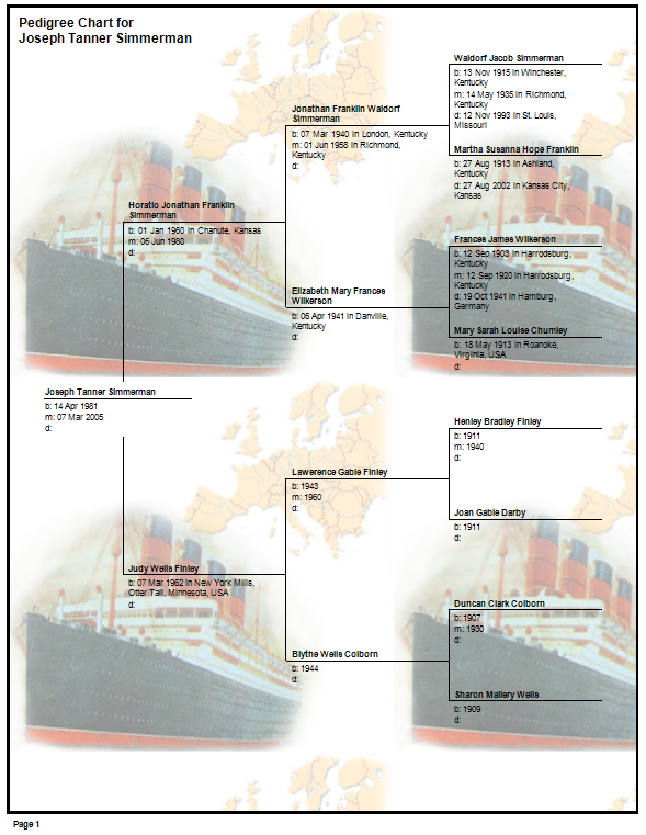
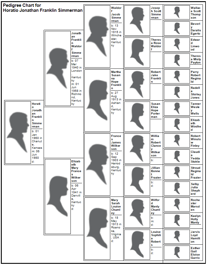
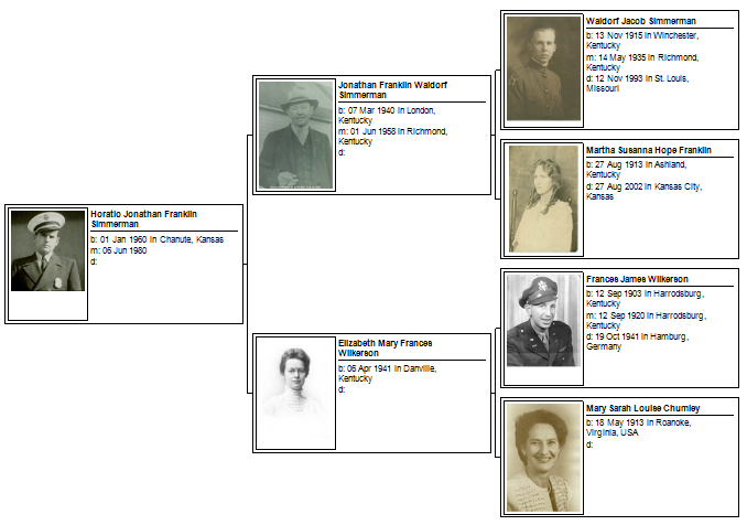
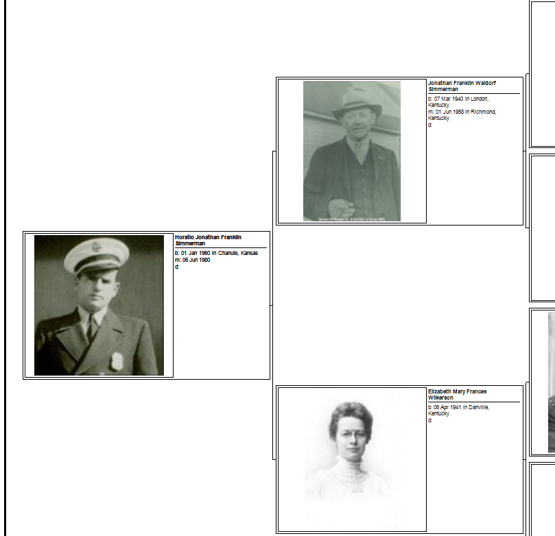
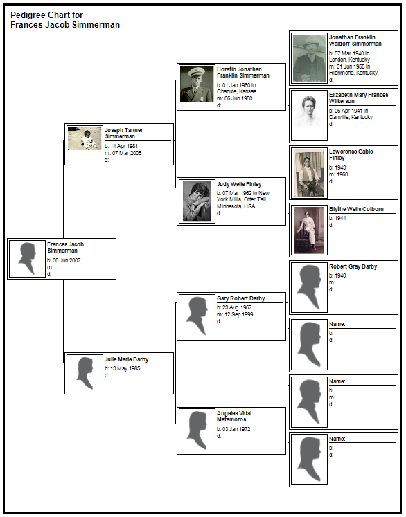
Pedigree Chart
Following are the default options for the Pedigree Chart.
Chart Title Control
The Chart Title Control shows the automatically generated title for the chart. Typically the title contains the root person’s name and the type of chart. The button on the right is used to reset the chart title. If you have typed in your own title and want to revert back to the auto-generated title it is done by clicking the reset button.
Layout Control
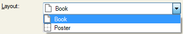
The Layout control for the Pedigree Chart has two options, Book and Poster.
The default setting is Book layout. Book layout is coupled with the Generations control found lower down in the options panel.
Book layout controls how many persons are displayed on a page. Additional persons are shown on subsequent pages.
Poster layout does not split the chart into “sub charts” instead it uses as many pages as necessary to display one continuous chart.
More details on this will be included with the description of the Generations Control.
Overlap Control
The overlap control affects the layout of the chart.
The choices are:
Columns Overlap
Only Root Overlaps
No Overlap
Fish Tail
Columns Overlap makes each generation in the Pedigree Chart overlap horizontally as shown in the following screen shot.
Only Root Overlaps means that the parent generation of the root node is overlapped but no other nodes are overlapped. This is shown in the following image.
No Overlap means that no generations will overlap horizontally. This is shown in the following image.
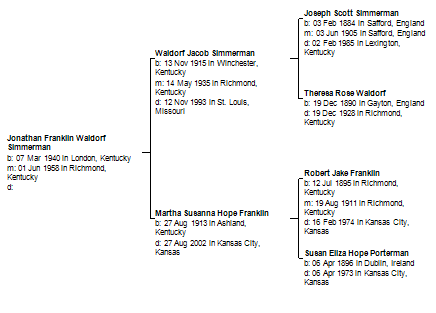
Fish Tail means that every generation but the last generation will have a horizontal overlap. On a three generation chart this will look exactly like “Only Root Overlaps”. The following image shows a four generation chart which shows “Fish Tail” overlap.
In FTM 2011 overlap is now completely honored in book layout. In FTM 2008 – FTM 2010 overlap was only applied in book layout if there was room to overlap the nodes. Now the node’s height is calculated such that the overlap can occur.
Following is a screen shot of book layout and only the root overlaps with squished spacing.
Now a screen shot with the overlap changed to “Columns Overlap”.
Now a screen shot with the overlap changed to “No Overlap”.
Now a screen shot with the overlap changed to “Fishtail”.
Now that overlapped is completely honored it shows up dramatically in book layout when there are larger values for generations and generations per page. Here is a screen shot where generations total and generations per page are set to five (5x5) with overlap set to “Columns Overlap”.
Overlap calculations are coupled with spacing values and to node box size values. The size of the node’s box is controlled in the “Box Border and Line Options” dialog.
In book layout the size of the box is controlled with specified maximum values. That is the node’s width or height will not exceed the value specified.
In conjunction with adjustments to spacing and overlap a lot of data can be fit into a chart. In the following example I will include every fact into the chart and set the maximum height of a box to be seven inches. Also, the spacing is set to squished and the overlap is set to no overlap.
Altering the overlap to fishtail, here is the same chart.
So, in conjunction with box sizes and spacing the overlap settings can produce many different charts.
Spacing Control and Apply Spacing Button
Apply Spacing Button
The Apply Spacing Button is a new control for FTM 2011. This button works in conjunction with charts that allow for the removal of persons. Poster layouts allow for persons to be removed from the chart. Book layouts do not allow for persons to be removed from the chart.
When persons are removed from a chart the space between nodes may become unpleasing to the user. To re-apply the spacing functions to the chart just click the “Apply Spacing Button”.
If you change the spacing through the “spacing control” the chart will be reloaded and the spacing will be recalculated. After the spacing control reloads and recalculates it then removes the previously removed persons. Sometimes this is the desired results, but when it is not use the “Apply Spacing Button” to only apply the spacing functions.
Spacing Control
The choices are:
Perfect
Collapsed
Squished
Custom
Perfect spacing varies in meaning depending on the layout. In “Book” layout perfect spacing is a fixed amount greater than collapsed spacing. Following is a screen shot of perfect spacing in book layout.
Compare that with “collapsed” spacing in book layout. The horizontal and vertical spacing between nodes is less in collapsed than in perfect. The following screen shot shows collapsed spacing.
“Squished” spacing uses values less than collapsed. Following is a screen shot of squished spacing in book layout.
In “Poster” layout perfect spacing has a different value. Perfect spacing in poster layout calculates the vertical spacing to be the height of the largest node plus the constant spacing value that is used in book layout. Following is a screen shot of prefect spacing in “poster” layout.
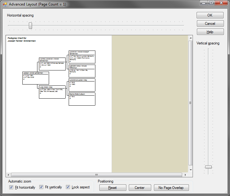
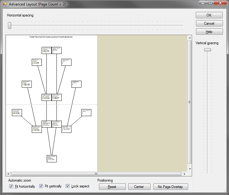
“Custom” spacing uses the values set in the “Advanced Layout” dialog when in “Poster” layout.
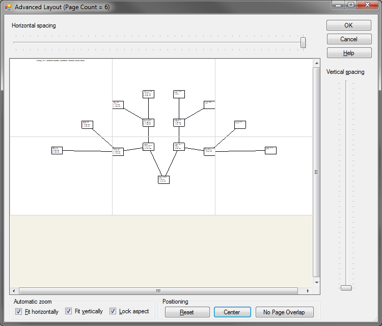
Just click the “Advanced…” button and the “Advanced Layout Dialog” is shown.
Through the use of the horizontal and vertical sliders the spacing amounts are adjusted.
Following is a screen shot where the vertical spacing has been adjusted.
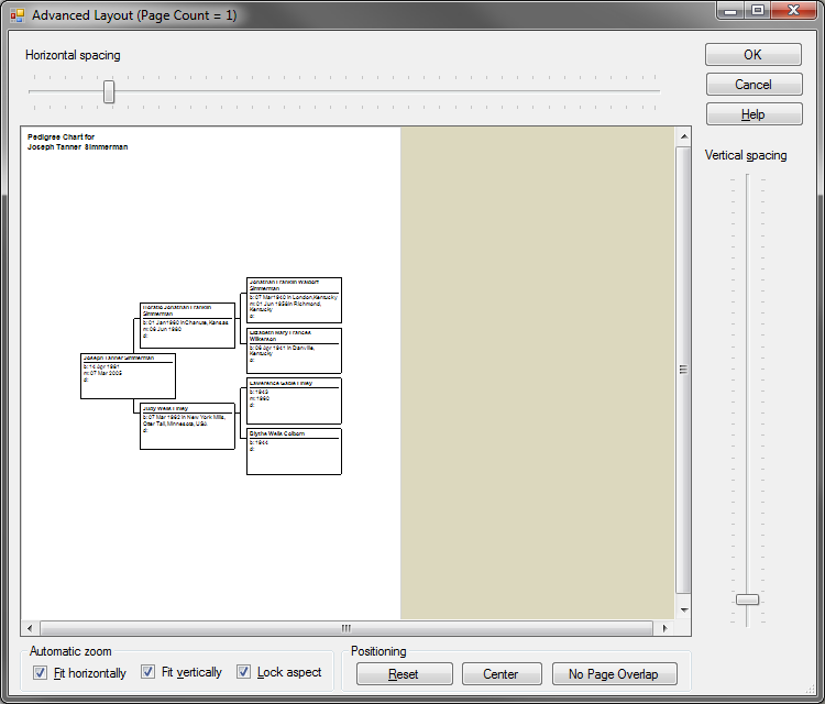
As a convenience to the user there are buttons to “Reset”, “Center” and apply “No Page Overlap” to the adjusted chart. In the image above the chart is vertically tighter now but it is not centered in the page. Instead of moving the nodes around in the Publish Detail Preview the user can just click “Center” to re-center the chart based on its new size.
Following is a screen shot showing the above chart centered.
When you leave the Advanced Layout Dialog the spacing control will indicate “Custom” spacing.
Let’s go back to “Book” layout and the usage of the Spacing control.
Perfect spacing in book layout actually produces smaller nodes in the right most generations. Why? Because the spacing is a fixed constant size and that spacing uses up available space that could have been used for the nodes. In FTM 2011 the default spacing for book layout is squished.
Here is a screen shot of perfect spacing.
Now for comparison here is the same chart using “squished” spacing.
Notice that the text in the last generation is not truncated when using squished spacing as it was when using perfect spacing.
Align Nodes
“Align Nodes” controls the way brackets are drawn and connected to the nodes. I think it should be named Bracket Format or something similar.
The choices are:
Top
Center
Bezier
Straight
Top alignment draws the bracket line so that it connects with the divider line in the node. Typically the divider line is the second item included in the node, but if the divider line was at some other location Top alignment would still connect to the node.
If there is no divider line included in the node then the line is drawn to the bottom of the first item included.
When there is a divider line included and there is no fill color for the box and no border on the box the line draws directly to the divider line.
However, if a fill color is used, even if it is the same color as the page’s background, the line does not draw directly to the divider line; instead it stops at the edge of the node.
Following is an image where the nodes are filled white.
Following is another image where the nodes are filled with non-white.
Notice the bracket lines do not connect to the divider lines.
If a border is added to the nodes it more clearly shows the bracket limits.
Center alignment draws the bracket directly to the center height of the node.
Personally I like to use borders and the node boxes when using any bracket alignment other than Top. Center alignment and nodes with borders are shown in the following image.
Bezier alignment draws a curved bracket.
Straight alignment draws a simple line to connect the nodes.
Certain bracket alignment choices should be used with other settings to produce charts that have certain expectations of symmetry. For instance, the Bezier brackets are not symmetric when the Box, Border, and Line option of “All boxes same size” is not checked for use. Following is an image illustrating the results.
Notice that the Bezier brackets are not similar. This is because the nodes have different heights. The Bezier bracket draws to the vertical center of the node when possible. If the node’s height is such that the node’s center is not usable the connection location is adjusted. However this can result in charts that are not very pleasing!
If you are determined to use Bezier brackets for the above chart then I recommend changing the Overlap to be “Columns Overlap”. The results follow.
When the bracket alignment does not produce pleasing results then I recommend trying another type of bracket. For instance the Center alignment works very well.
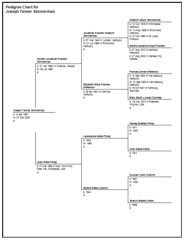
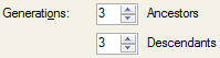
Generations Control
The Generations control is tied to the Layout Control.
If the Layout is “Book” then the Generations control looks as it does above.
If the Layout is “Poster” then the Generations control is changed in that the “per page” option is disabled.
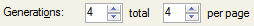
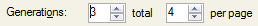
The Generations control has two values, “total” and “per page”.
“total” generations are how many generations to display. If “Include empty branches” is checked then the chart will have the “total” number of generations. If it is not checked the chart will stop when there are no more ancestors up to “total” generations.
“per page” indicates how many generations to place upon a page before the chart splits to a sub-chart on which will follow on a subsequent page and have page indicators to allow the user to find or click and go to the subsequent page.
Generations Control with Book Layout
The preceding settings I will refer to as 4x4 generations.
The following settings I would refer to as 3x4 generations.
Then generic formula is [total] X [per page].
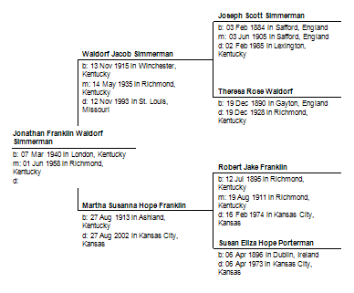
A chart with 4x4 generations, the results are as follows:
I will now increase the “per page” setting so that the chart is 4x5 generations. The results are shown and there is actually no change in the chart.
The reason is that the “total” did not change. By changing the chart to be 5x5 generations there will be five generations displayed on a single page.
Immediately I notice that the brackets to the last generation look strange. What is going on? To illustrate what is going on I first put borders on the nodes’ box.
The borders show that the nodes are taking up as much space as is available.
I prefer to uses borders and Center aligned brackets when I make a Pedigree Chart in Book Layout. The results are shown below.
A 6x6 generation chart packs all six generations onto a single page.
If you really want a 6x6 generation chart I suggest changing font sizes and even paper sizes (found in Page Setup). Following is a 6x6 generation chart using 6 point fonts and 11x17 paper.
I find that a Nx4 chart is usually pleasing for 8.5”x11” paper or similar sizes.
Following is 6x4 generation chart. Notice that each page has no more than four generations and that the subsequent data is placed in sub-charts on different pages.
This particular chart takes nine pages to capture the entire six generations.
Generations Control with Poster Layout
In Poster Layout the “per page” portion of the Generations control is not used. There has been debate on wither the “per page” should be hidden or disabled and currently the choice is disabled.
With the default settings of the Pedigree chart a three generation chart looks as follows.
The entire three generation chart fits on a single page. A four generation chart with spacing set to “Squished” also fits on a single page as shown below.
A four generation chart using poster layout and the spacing set to “perfect” requires two pages as shown below.
Poster layout uses the number of pages necessary to contain the chart.
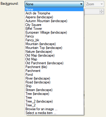
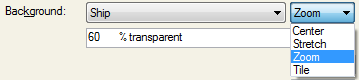
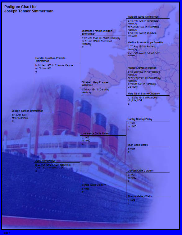
Background Control
There are three controls that make up the background control.
A drop down list to choose a background image.
A combo-box to select the layout of the image.
A numeric control to adjust the value of the transparency.
The Background Control places an image in the background of the chart. That means it is behind the chart nodes, the chart title, and any other items in the chart. The background is above the “paper” so if you have set a color in the “Box Border and Line Options” dialog through the use of the transparency control the chart background color can show through.
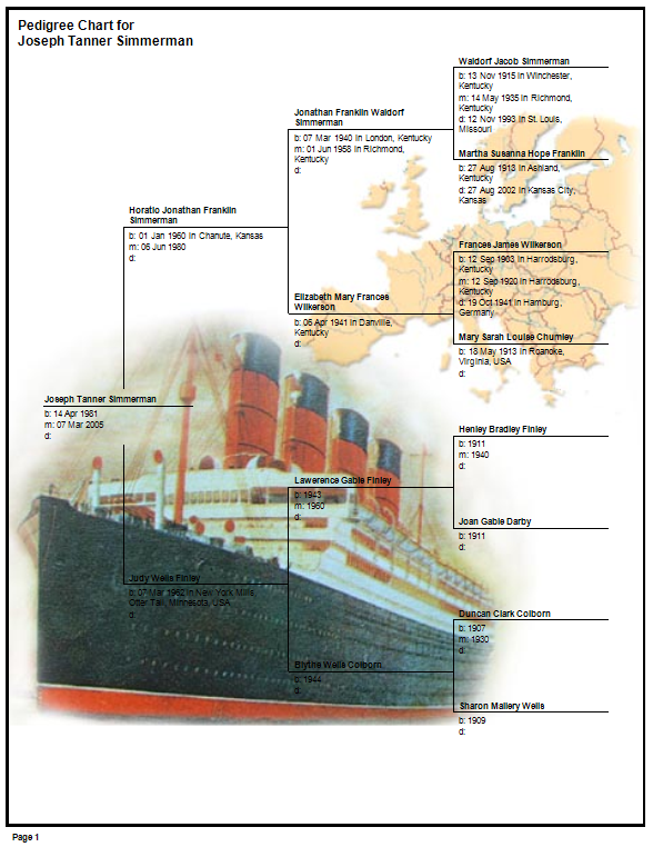
Following is a screen shot using the ship background image, zoomed, and transparency set to zero.
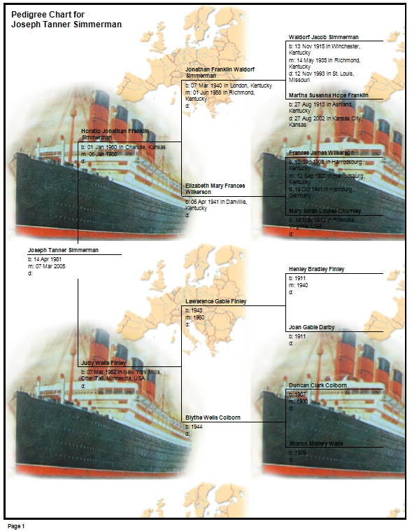
Following is a screen shot where the layout was changed from zoomed to “centered”.
And below is a screen shot using “stretched”.
And finally a screen shot using “tiled”.
Here are the same settings as above with the transparency set to 50%.
Now if you go into the “Box Border and Line Options” dialog and set the background color to blue and the image layout to “zoomed” you get the following results.
I am not saying that is a pretty chart. The settings are to illustrate how the background image is above the background color.
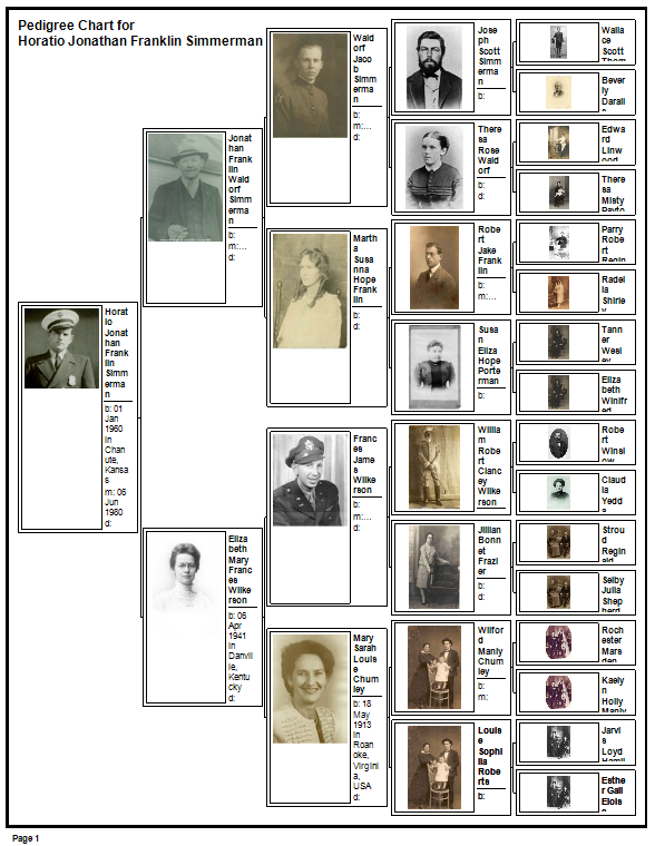
Pictures Control
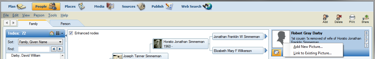
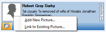
The Pictures control manipulates the settings for pictures inside of a person’s node in the chart. To associate a picture with a person go to the People module and “right click” or “secondary button click” on the silhouette icon next to the person’s name found at the top of the right panel.
The popup menu allows you to associate the picture to the person.
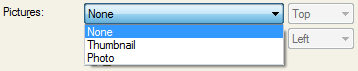
Back in the Publish Module, the Pictures control has a drop down list with the following choices:
Thumbnail uses a lower resolution version of the “photo” associated to a person. This can greatly reduce memory usage and improve drawing performance.
The Pictures control has a drop down list to control the layout of the image inside of the picture area of the node.
The values for layout drop down list are:
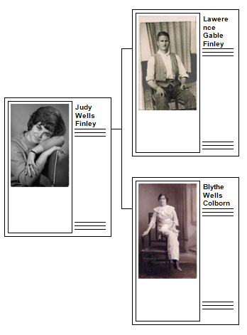
The best way to describe these positioning settings is through screen shots. I have setup a chart with just two generations in book layout. In the “Items to Include” I have chosen several divider lines and blank lines.
These items will make a nice tall node.
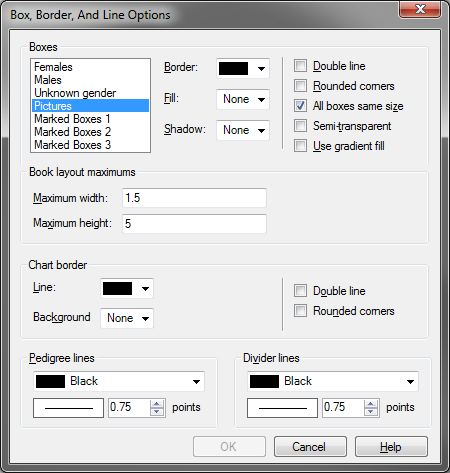
In the “Box Border and Line Options” I have placed a border around the “Pictures” and made the maximum width 0.5, maximum height 5.
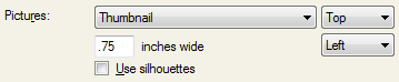
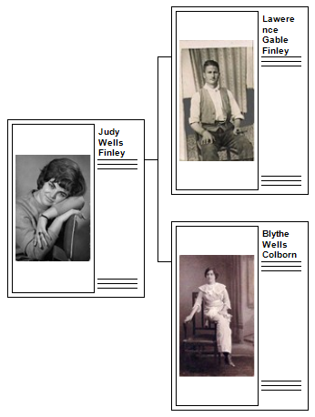
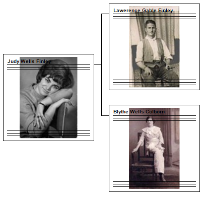
In the Pictures control I set the width of the image to 0.75, positioning set to “Top” and location set to “Left”.
The resulting chart is this:
The position setting of “Top” places the image at the top of the picture box inside of the node (in this case on the left side). The image’s aspect ratio is maintained with the “top” setting.
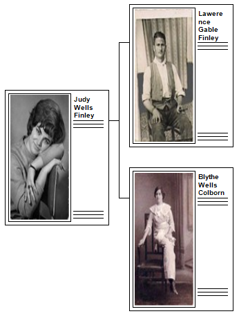
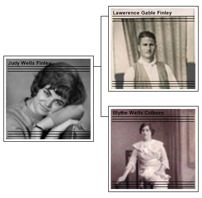
Below is the same chart with the position set to “Center”.
As with “top” the “center” position maintains the aspect ratio.
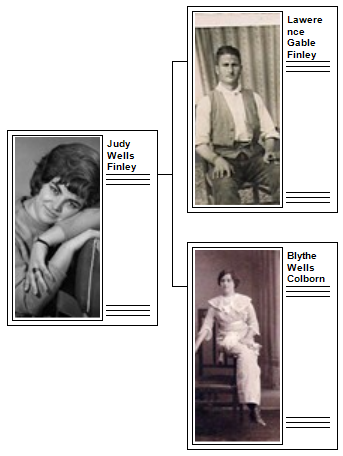
The following image shows the same chart with the position setting of “Stretch”.
With “Stretch” the image fills the picture area and does not maintain the aspect ratio of the image.
Following is the results of setting the positioning to “Zoom”.
“Zoom” maintains the aspect ratio of the image however portions of the image may be cropped. In this example the images are cropped horizontally.
The Pictures Control has a location control. The values for the location control are:
All of the preceding screen shots demonstrate the location set to “left”.
Here are the results of setting the location to “right”.
The position setting is still on “zoom”.
Here is the same chart with the location set to “Background”.
Well, that is not a very pretty chart.
So, go into the “Box Border and Line Options” dialog and set the Maximum width to 1.5.
The resulting chart follows.
Well, with the position set to “Zoom” the cropping of the image is apparent and the aspect ratio is maintained. This will be good to show the other position settings when used with the location set to “Background”.
Here are the results using “Center” positioning.
Notice with center the aspect ratio is maintained.
Setting the positioning to “Top” with the location set to “Background” is different than when the location is “left” or “right”.
Here is a screen shot of “Top” with “Background”.
With location “Background” and position “Top” the image is zoomed and the top of the image is aligned with the top of the picture box of the node. That means there will be no cropping of the top of the image and it will give you as much zoom as possible while maintaining the aspect ratio.
Setting the positioning to “Stretch” with the location set to “Background” gives the following results.
The Pictures Control has a width control.
This control behaves differently in Poster and Book layouts. The control does not affect the chart when the location is “Background” and so when “Background” location is selected the width control is hidden.
For the following examples I have set the pedigree chart to “Book” layout and in the “Box Border and Line Options” I have set the maximum width to 1 and the maximum height to 3. Also there is a border around the picture box.
In the Picture control the width of the image is set to 1.
The results follow.
The total node width is the node width maximum which is “1” plus the image width which is also “1” therefore the node’s total width is two inches.
Remember that the box size in book layout specify maximum values and not absolute values. Also recall that in book layout the number of generations specified will be placed in the chart even if the box size has to be reduced.
Following is a screen shot of a pedigree chart in book layout with the generations set to 5x5. There is no way that five generations can be displayed with two inches width on a page that is only 8.5 inches wide.
In book layout the image width and box width are used to make a ratio. In the case of box width of one and image width of one the ratio is ½. This means that the image will take up ½ of the total width of the box. Thus the ratio of the box width and image width are maintained. This often confuses users because the image box gets smaller and smaller. This needs to be the case because if it did not do this the book layout would soon become a confusing mess.
To illustrate this here is a screen shot from FTM 2009 which maintained the image width to the value specified. This screen shot is using the exact same settings as the example above from FTM 2011.
Unfortunately the FTM 2009 database I am using does not have the associated media, but the silhouettes illustrate the issue.
To exaggerate this issue I will set the image width to 2 inches and the box width to 1 inch.
Here are the results in FTM 2011 with the image width set to 2 inches, box width to 1 inch, spacing set “squished”, with no overlap.
And here is the same chart from FTM 2009 which did not maintain the picture width to box width ratio.
In FTM 2009 the image width completely dominates the width of the nodes and makes a mess! I hope the reasons for making FTM 2011 maintain the image width to box width ratio are acceptable.
Poster layout does not alter the box size or image width. Here is a chart with the box width set to 2 and the image width set to 1.
Following is a screen shot of the same chart with the image width set to 3 and the box width set to 2.
The Pictures control has a check box to indicate that if there is no photo associated with the person to use a silhouette in its place.
Following is a screen shot that illustrates the uses of silhouettes.
“Checkbox” Options
The “Checkbox” options are the group of options below the divider line and above the “Generate Chart” button.
In “Book” layout for the Pedigree chart the checkbox options are:

In “Poster” layout for the Pedigree chart the checkbox options are:
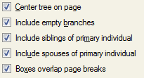
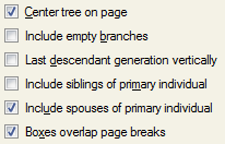
Center tree on page
Include empty branches
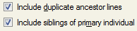
Include duplicate ancestor lines
Include siblings of primary individual
Include spouses of primary individual
Boxes overlap page breaks.

Checkbox options for “Book” layout
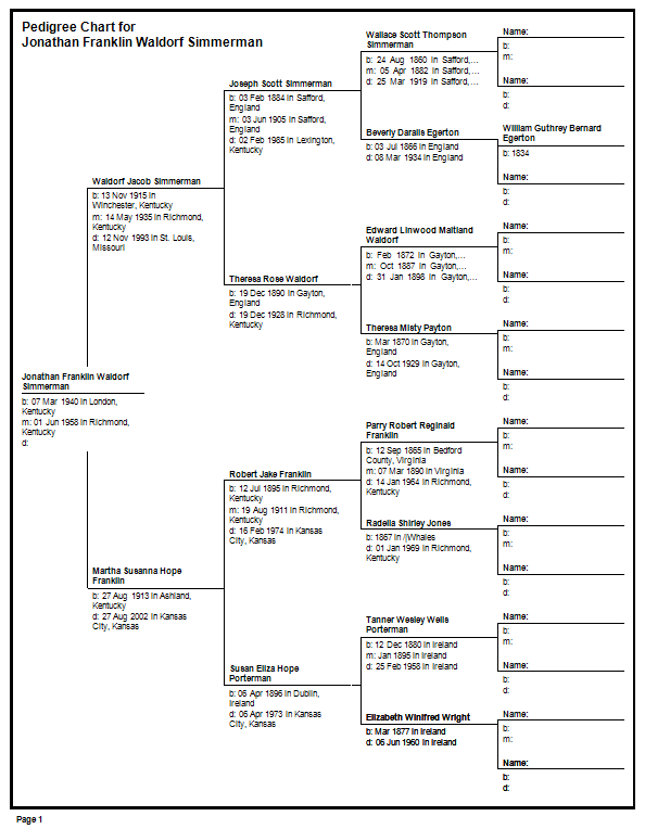
“Include empty branches” fills out the pedigree to the number of generations specified and inserts empty nodes as required. Here is a three generation chart that includes empty branches.
And here is the same chart without the empty branches.
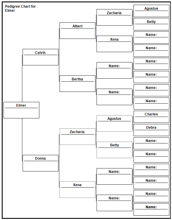
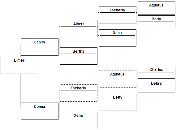
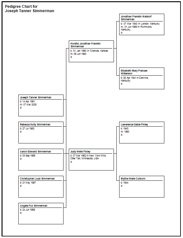
To illustrate “Include duplicate ancestor lines” I have created a small database with cousins married to cousins. We call that the “red neck factor”.
Note that the “Include empty branches” overrides “Include duplicate ancestor lines”. If the user wants to fill out the chart fully with empty branches then duplicate ancestors are used even if the checkbox for “Including duplicate ancestor lines” is not checked. It would not make sense to remove duplicate ancestors and replace them with empty boxes.
Here is a screen shot of a nice little red neck tree with empty branches checked and include duplicates checked.
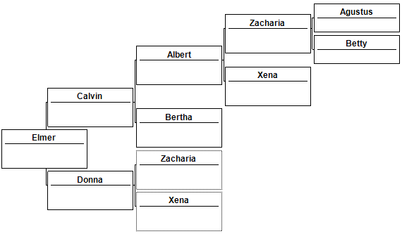
By un-checking “Include duplicate ancestor lines” while having “include empty branches” checked the chart will not change.
Here is the same chart with “include empty branches” unchecked and “include duplicate ancestor lines” checked.
Here is the same chart with “include empty branches” unchecked and “include duplicate ancestor lines” unchecked.
Include duplicates is effected by the order in which nodes are loaded into a chart. In this case the line of Elmer, Calvin, Albert, Zacharia, and Agustus is loaded before Elmer, Donna, Zacharia. When Zacharia is loaded the second time it is recognized as a duplicate in the chart and no more loading along that line is performed.
Notice that when a node is duplicated in a chart its outline is drawn with a dashed line to indicate that this person exists somewhere else in the chart.
Checkbox options for “Poster” layout
Checkbox “Center tree on page” centers the chart in the total available page space.
Here is a screen shot where center tree is not checked.
Here is the same chart with center tree checked.
The checkboxes for “Include empty branches” and “Include duplicate ancestor lines” behave the same in Poster layout as they do in “Book” layout. (See above in book layout for their description.)
The checkbox “Include siblings of the primary individual” includes the siblings of the root node positioned below the root node.
Here is a screen shot of the siblings included.
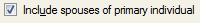
The checkbox “Include spouses of the primary individual” includes any spouses of the root person positioned below the root person.
Here is a screen shot of the inclusion of the spouses of the primary individual.
Here is a larger image of the above chart showing how the connection is drawing to the spouse.
Both “spouses” and “siblings” can be included at the same time.
Above is a two generation chart with spouses and siblings of the primary individual included.
The checkbox “Boxes overlap page breaks” is only available in Poster layout. In Book layout there should never be any boxes overlapping from one page to another.
In the following screen shot the paper size is “Envelope C5” which is 6.38”x9.02”.
Uncheck the checkbox “Boxes overlap page breaks”.
Following is a screen shot of the results.
Notice that the boxes were moved to the right. Also notice the bracket line from the root person to its parents seems to be drawn twice. The line happens to fall upon the page break and therefore it is drawn for each page.
 Click the page break button at the top of the Preview panel and view the chart in a continuous view where page breaks are not shown. The resulting screen shot follows.
Generate Chart Button and Chart Reset Button
Generate Chart Button
The generate chart button causes the chart to be reloaded from the root person using the generations specified and position and size the chart nodes according to the options selected.
Generate Chart resets node locations.
Generate Chart does not affect the chart title, inserted images, node markings, or removed persons.
When clicking Generate Chart the following takes place:
The state of node markings and removed persons is saved.
The internal data representation is completely discarded.
A new chart is read from the database and stored in the internal data representation.
Node markings are reset and any markings applied will be lost.
Node positions are reset and any nodes that had been moved will be repositioned to their default location.
The chart title is not reset or relocated. The chart title is not part of the data that represents the nodes and therefore it is not reset.
Inserted images will not be removed. Images are not part of the data that represents the nodes and therefore are not removed. Images can be removed by selecting them and deleting them.
I use the Generate Chart button when I have removed nodes or marked nodes and I want to retain those settings and I want to reposition nodes to their original location.
Chart Reset Button
The chart reset button causes the chart to be reloaded from the root person using the generations specified and position and position and size the chart nodes according to the options selected.
Chart Reset resets node locations, markings, and restores any persons removed.
Chart Reset does not affect the chart title or inserted images.
When clicking Chart Reset Button the following takes place:
The internal data representation is completely discarded.
A new chart is read from the database and stored in the internal data representation.
Node markings are reset and any markings applied will be lost.
Node positions are reset and any nodes that had been moved will be repositioned to their default location.
The chart title is not reset or relocated. The chart title is not part of the data that represents the nodes and therefore it is not reset.
Inserted images will not be removed. Images are not part of the data that represents the nodes and therefore are not removed. Images can be removed by selecting them and deleting them.
I use Chart Reset when I want to start over.
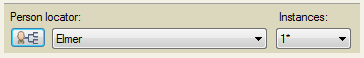
Person Locator
The person locator is something I came up with while developing the Extended Family Chart. I realized that it was nigh impossible to find anyone in the chart. Scrolling and following bracket lines became tedious and aggravating. So, I invented the Person Locator.
The Person Locator is made of three controls.
 “Select Root Person of Chart”
 “List of Persons in the Chart”
 “Instances” of a person in a chart. If a person is in the chart more than once this control navigates to the other instances of the person.
The Person Locator is tied to the chart in two ways. If you click and select a node in the chart it will update the Person Locator. If you select a person in the Person Locator it will scroll the chart so that person is visible and select that person.
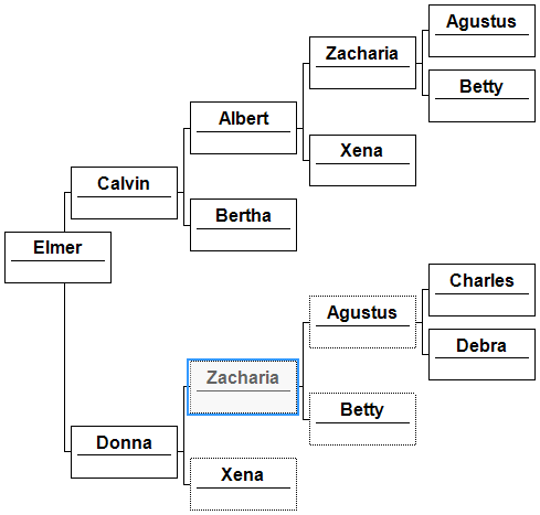
In the following screen shots I am using a small chart that has duplicated persons.
Following is a screen shot showing the results of clicking the “Select Root Person of Chart”.
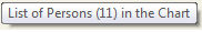
If you hover the mouse above the list of persons it will indicate how many unique persons are in the chart.
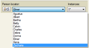
Click the person list and a list of persons is shown.
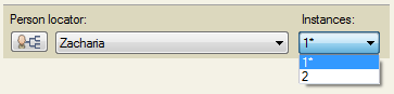
Selecting the last person in the list “Zacharia” gives the following results.
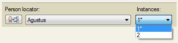
Notice that there is more than one instance of this person in the chart. Click the “Instances” drop down list.
Select “2” in the list. The next instance of the person is selected. The results follow.
There is an asterisks (*) next to one of the entries in the “Instances” drop down list. This asterisks is used indicate which instance was selected when clicking a node in the chart.
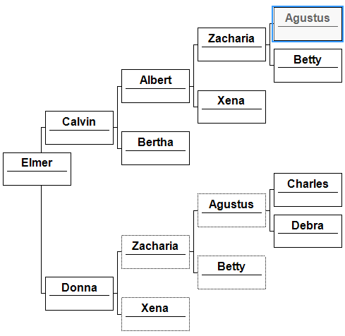
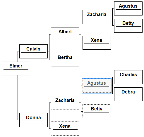
Following is the results of clicking the node “Agustus” in the top right of the chart.
Clicking the “Instances” drop down list reveals the following.
Now from the chart I will click on the node for Agustus that is in the lower middle of the chart. The results are shown below.
Notice that the asterisk is next to the 2nd instance. This indicates that the node selected from the chart is the second instance in the list.
Horizontal Hourglass Chart
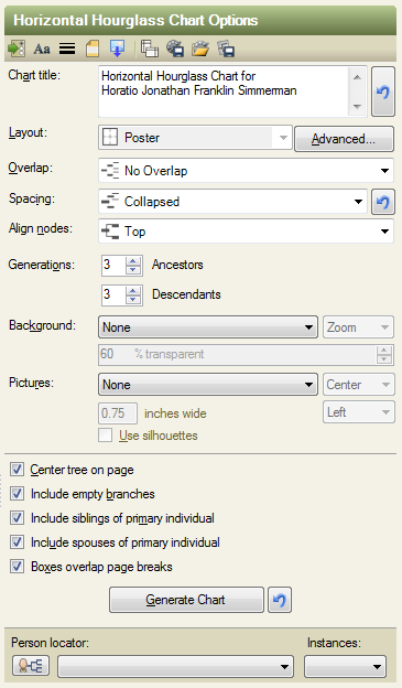
Following are the default options for the Horizontal Hourglass Chart.
Chart Title Control
See Pedigree Chart: Chart Title Control
Layout Control
The only layout option for the Horizontal Hourglass Chart is Poster Layout.
Overlap Control
See Pedigree Chart: Overlap Control
Spacing Control
See Pedigree Chart: Spacing Control
Align Nodes
See Pedigree Chart: Align Nodes
In the Horizontal Hourglass Chart the brackets are drawn to descendant nodes. This is different that the Pedigree Chart.
The Bezier alignment for the descendant portion of the chart uses straight lines instead of Bezier lines.
Following is a screen shot.
There are two reasons for using straight lines for the descendants instead of Bezier curves.
The lines are so close to each other that they intersect.
There isn’t a uniform curvature for the lines which make them unattractive.
Generations Control
The Generations Control for the Horizontal Hourglass chart, and any chart type that shows both ancestors and descendants, specify how many ancestor generations and how many descendant generations.
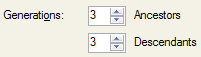
Consider the setting of zero ancestors and zero descendants.
I refer to this as a 0x0 generations Hourglass chart.
The resulting chart will have one node, the root person.
Creating a 1x1 chart is shown below.
The chart has one generation of ancestors and one generation of descendants.
Notice that the checkbox option “Include empty branches” only applies to the ancestor portion of the chart. Following is a screen shot of a 1x1 chart where the root person does not have any descendants. “Include empty branches” does not make an empty child node for the root person.
Background Control
See Pedigree Chart: Background Control
Pictures Control
See Pedigree Chart: Pictures Control
“Checkbox” Options
The “Checkbox” options are the group of options below the divider line and above the “Generate Chart” button.
The checkbox options for the Horizontal Hourglass chart are:
Center tree on page
Include empty branches
Include siblings of primary individual
Include spouses of primary individual
Boxes overlap page breaks
These options are very similar to the Pedigree chart in poster layout.
See Pedigree Chart: Checkbox Options for Poster Layout
The Pedigree has the option for “Include duplicate ancestor lines” where the Horizontal Hourglass chart does not. The Horizontal Hourglass chart always includes duplicate ancestors.
Following is a 5x0 chart showing how duplicate ancestors are displayed.
Generate Chart Button
See Pedigree Chart: Generate Chart Button
Person Locator
See Pedigree Chart: Person Locator
Bowtie Chart
Following are the options for the Bowtie chart.
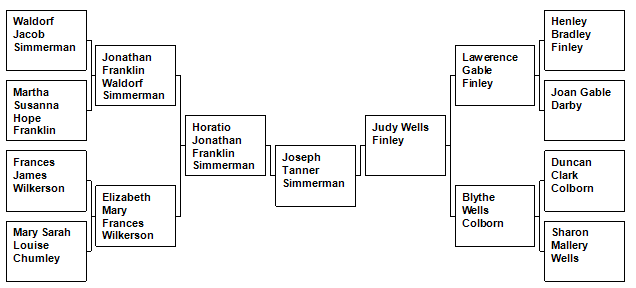
The Bowtie chart is similar to the Pedigree chart. The Bowtie chart only shows ancestors and is in a horizontally flowing layout. Following is a screen shot of a three generation Bowtie chart.
The father of the root person is found on the left of the chart while the mother of the root person is on the right of the chart.
Chart Title Control
See Pedigree Chart: Chart Title Control
Layout Control
See Pedigree Chart: Layout Control
The only layout option for the Bowtie Chart is Poster Layout.
Spacing Control
See Pedigree Chart: Spacing Control
Generations Control
The Generations Control for the Bowtie chart only has settings for ancestor generations.
The root node’s father and the father’s ancestors are on the left side of the chart. The root node’s mother and mother’s ancestors are on the right side of the chart.
Following is a screen shot of a four generation Bowtie chart.
Background Control
See Pedigree Chart: Background Control
Pictures Control
See Pedigree Chart: Pictures Control
“Checkbox” Options
The “Checkbox” options are the group of options below the divider line and above the “Generate Chart” button.
The checkbox options for the Bowtie chart ar:
These options are very similar to the Pedigree chart in poster layout and the Horizontal Hourglass chart.
See Pedigree Chart: Checkbox options for Poster Layout
See Horizontal Hourglass Chart: Checkbox options
Checkbox option “Include empty branches” behaves the same as the Pedigree chart in that ancestor generations are filled out to the number of generations specified.
Following is a Bowtie chart using three generations and including empty branches.
Following is a Bowtie chart with three generations and no empty branches.
“Include siblings of primary individual” includes the siblings below the primary individual.
Following is a Bowtie chart with siblings of the primary individual included.
Generate Chart Button
See Pedigree Chart: Generate Chart Button
Person Locator
See Pedigree Chart: Person Locator
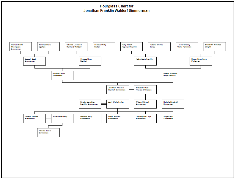
Hourglass Chart (Vertical)
The Hourglass Chart is vertically oriented chart that displays ancestors and descendants. Also the Hourglass Chart has both “Poster” and “Book” layout.
The Descendant Chart and Vertical Pedigree Chart are special cases of the Hourglass Chart. This means that any Descendant Chart or Vertical Pedigree Chart can be made using the Hourglass Chart.
Following are the default options for the Hourglass Chart.
Chart Title Control
See Pedigree Chart: Chart Title Control
Layout Control
The default setting is “Poster”.
The Hourglass Chart has both “Poster” and “Book” layout.
Layout Control “Poster”
A chart in “Poster” layout uses as many pages as needed to contain the chart.
Following is a screen shot of an Hourglass Chart using the default settings.
The chart has three generations of ancestors and three generations of descendants.
Following is a screen shot of an Hourglass Chart that uses multiple pages.
To change the number of pages a chart uses the user should consider adjusting the following options:
Layout Control “Book”
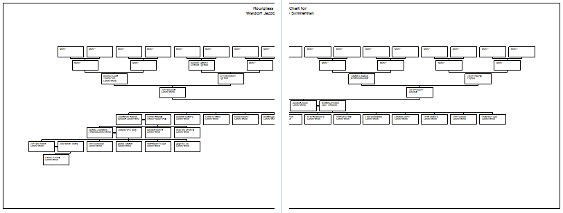
A Horizontal Chart in “Book” layout splits the chart such that the person nodes fit on a page and nodes that did not fit on the page are placed on a subsequent page.
Following is a screen shot of the same two page “poster” chart above using “book” layout.
The resulting chart uses three pages.
Following is a closer examination of each page.
When an Hourglass Chart in book layout is first loaded it loads the entire chart and measures it to check if it fits on a single page. If it does not then the chart is checked for such things as “the widest generation”, “multiple spouses”, “multiple siblings”, and “multiple children”. These areas are candidates for a location in which the chart can be divided.
In the chart above the root person has multiple siblings and the chart is split at that point. A “page indicator” is placed with a bracket that shows it is a split of siblings or children and not a split on a spouse.
Following is a screen shot showing the location at which the chart was split and the page indicator showing the page where the chart continues.
By clicking on the page indicator the Publish Details Preview View will scroll to the page indicated.
Following is a screen shot of page two.
Notice that there is a page indicator linking this chart back to page one and also notice that this chart was split again on to page three.
Closer examination of the chart follows.
When the chart is split the same process is applied on the new “sub” chart to see if it fits on a single page. If it does not then the chart is split again.
Sub charts show as much context as possible without causing a split. In this particular case the page is able to contain two generations of ancestors.
In the pre-release versions of the Hourglass chart the computer algorithms did not include as much context as possible. The resulting sub chart only contained the minimum amount of nodes. Here is a screen shot of what that looked like.
It was decided that since there was empty space on the page to put as much context on the page as possible. The intent is that when someone is viewing the page they can better understand the context of the persons displayed.
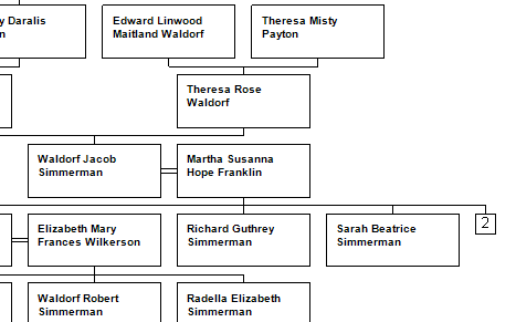
The person nodes with the gray or dashed borders are person’s that are repeated on another page. By clicking on one of these persons and then using the Person Locator the user can navigate to all of the instances of that person.
Finally a screen shot of page three, the last page of “book” layout.
Notice that page three has a page indicator linking it back to page two.
When an Hourglass Chart is split on multiple spouses the connector to the page indicator is drawn with the same style as are the brackets from a person to their spouse. Here is a screen shot of an Hourglass chart split on multiple spouses.
By examination of the connecting bracket to a page indicator the user can determine if the split was on a spouse or on a sibling or child.
Hourglass Charts in book layout can also split on ancestor lines. Here is a screen shot showing the appearance of an ancestor split.
The screen shot shows that the ancestors were split onto two pages, page two and page three.
Following is a screen shot of page two.
To change how a chart is split or divided the user should consider adjusting the following options:
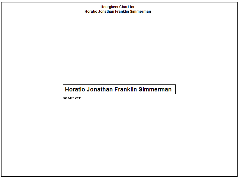
It is possible to create chart settings in which the chart cannot split or divided into sub charts. One of the most common ways to create this situation is when the person’s node box is large. If the box is wider than half of the page width or taller than half the page height there is no manner of splitting the chart.
Following is a screen shot of a chart that could not be split. The reason is that I have set the box width to four inches.
Notice the text “Chart does not fit”. That indicates that there is now way to split or divide the chart. If you see this in your charts examine the box sizes in the “Box Border and Line Options” dialog.
On occasion the chart cannot be split and the person node is displayed in such a manner that the “Chart does not fit” text is hidden.
Spacing Control
Spacing refers to the space between the person node boxes. There is horizontal and vertical separation or space between every node and ever generation of nodes.
The default spacing for the Hourglass Chart is “perfect”. In this case “perfect” means more than “collapsed” and “collapsed” means more than “squished”.
The “custom” spacing is control through the “Advanced Layout” dialog.
The “Advanced Layout” dialog is only available for poster layout.
Here is a screen shot of the “Advanced Layout” dialog. The horizontal spacing has been decreased and the vertical spacing has been increased.
Through the use of the horizontal and vertical sliders the spacing amounts are adjusted. As a convenience to the user there are buttons to “Reset”, “Center” and apply “No Page Overlap” to the adjusted chart.
For related information see: Pedigree Chart: Spacing Control
Generations Control
See Horizontal Hourglass Chart: Generations Control
Background Control
See Pedigree Chart: Background Control
Pictures Control
See Pedigree Chart: Pictures Control
“Checkbox” Options
The “Checkbox” options are the group of options below the divider line and above the “Generate Chart” button.
The checkbox options for the Hourglass chart in “Poster” layout are:
Center tree on page
Include empty branches
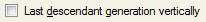
Last descendant generation vertically
Include siblings of primary individual
Include spouses of primary individual
Boxes overlap page breaks
The checkbox options for the Hourglass chart in “Book” layout are:
The following options are very similar in all chart types:
Center tree on page
Include empty branches
Include siblings of primary individual
Include spouses of primary individual
Boxes overlap page breaks
For these options see Pedigree Chart: Checkbox Options and Horizontal Hourglass Chart: Checkbox Options.
In “poster” layout the option “Display last descendant generation vertically” is used to control the width of the Hourglass chart. Hourglass charts tend to be widest at the last generation.
Following is a screen shot with the checkbox “Display last descendant generation vertically” not checked.
Below is a screen shot with the checkbox “Display last descendant generation vertically” checked.
Notice the last generation and how the generation is vertical with spouses listed vertically as well. The brackets to spouses are the same brackets used in all of the chart types.
The brackets to the children in the last generation are drawn differently so that the user can tell that the nodes connected are all of the same generation and are all siblings.
The nodes in poster layout can be moved by the user. Here is a screen shot of the same nodes as above after they have been repositioned by dragging the nodes with the mouse.
Notice how the brackets are drawn to help the user recognize that the nodes are siblings along with their spouses. Consider the node “Rebecca Holly Simmerman”. The bracket comes out of the right side of the box and it is tilted upwards at an angle to indicate that this bracket flows upward to the parent.
Generate Chart Button
See Pedigree Chart: Generate Chart Button
Person Locator
See Pedigree Chart: Person Locator
Descendant Chart
The Descendant Chart is a special case of the Hourglass Chart. The Descendant chart displays the descendants of the root person and may also include the siblings and spouses of the root person. The Descendant Chart does not display ancestors of the root person.
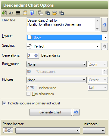
Following are the default options for the Descendant Chart (note Poster Layout is the default).
Following is a screen shot of a default Descendant Chart.
Descendant Charts can have “Poster” or “Book” layout.
Here are the options for “Book” layout.
Many of the options available for the Descendant Chart behave the same as those options found in the Hourglass Chart.
See Hourglass Chart for more information.
Generations Control
The Descendant Chart displays only descendants of the root person and may also include the siblings and spouses of the root person.
(Setting the Hourglass Chart’s ancestor generations to zero and it will produce a Descendant Chart.)
Setting the Generations control to zero will display the root person with no descendants.
Vertical Pedigree Chart
The Vertical Pedigree Chart is a special case of the Hourglass Chart. The Vertical Pedigree Chart displays the ancestors of the root person and may also include the siblings and spouses of the root person. The Vertical Pedigree Chart does not display descendants of the root person.
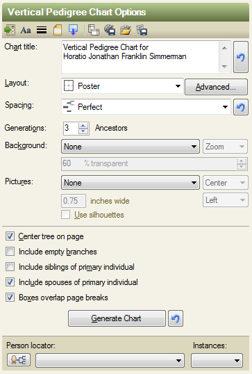
Following are the default options for the Vertical Pedigree Chart (note that Poster Layout is the default).
Following is a screen shot of a default Vertical Pedigree Chart.
Vertical Pedigree Charts can have “Poster” or “Book” layout.
Here are the options for “Book” layout.
Many of the options available for the Vertical Pedigree Chart behave the same as those options found in the Hourglass Chart.
See Hourglass Chart for more information.
Generations Control
The Vertical Pedigree Chart only displays ancestors and the Generations Control sets the number of generations to be displayed.
(Setting the Hourglass Chart’s descendant generations to zero and it will produce a Vertical Pedigree Chart.)
Setting the value of the Generations control to zero displays only the root node without any ancestors.
Family Tree Chart
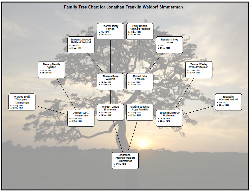
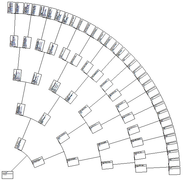
The Family Tree Chart is an “ancestor only” chart that has positions the nodes in the semblance of a tree.
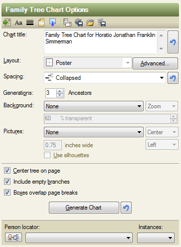
Following is a screen shot of the options for a Family Tree Chart.
The Family Tree Chart displays only the ancestors of the root person. Siblings or spouses of the root person cannot be displayed in the Family Tree Chart.
Many of the options of the Family Tree Chart behave similar to those of the Hourglass Chart. For more information see the Hourglass Chart.
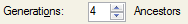
Generations Control
The Family Tree Chart only displays ancestors.
See Vertical Pedigree Chart: Generations Control.
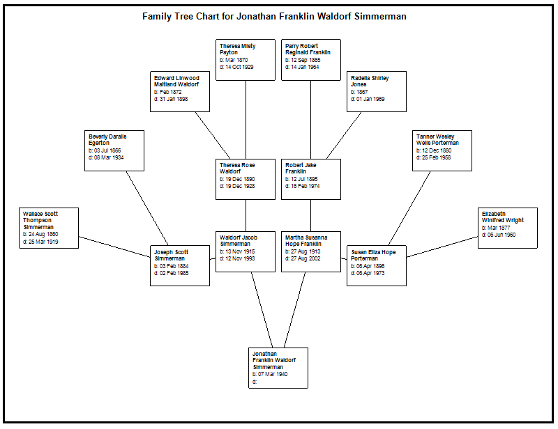
Following is a screen shot of a default Family Tree Chart.
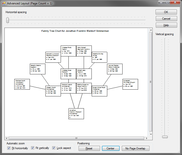
The “Advanced Layout” dialog is also available for the Family Tree Chart.
Following is a screen shot of the “Advanced Layout” dialog with the horizontal spacing and the vertical spacing set to their respective minimum values.
Following is a screen shot with the horizontal spacing set to its maximum value and the vertical spacing set to its minimum value.
And finally a screen shot showing the horizontal spacing set to the minimum value and the vertical spacing set to the maximum value.
The screen shots are intended to illustrate the horizontal and vertical spacing components as applied to a Family Tree Chart.
Following is a screen shot of a Family Tree Chart with a background image of a tree.
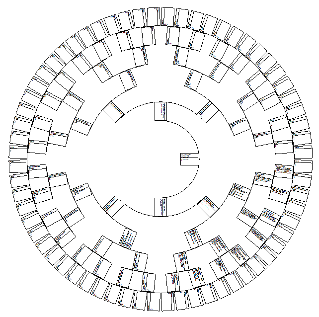
Fan Chart
The Fan Chart in FTM 2011 replaces the 180 Fan Chart found in FTM 2010. The Fan Chart displays only the ancestors of the root person. Siblings or spouses of the root person cannot be displayed in the Fan Chart.
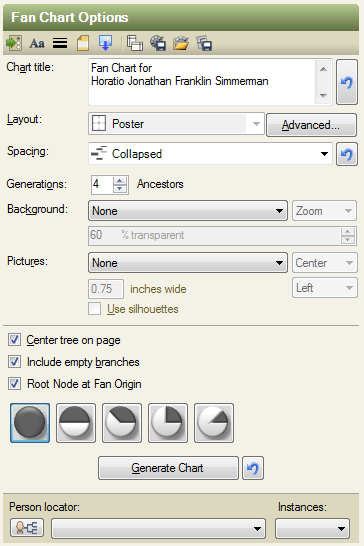
Following are the default options for the Fan Chart.
There is only “Poster” layout for the Fan Chart.
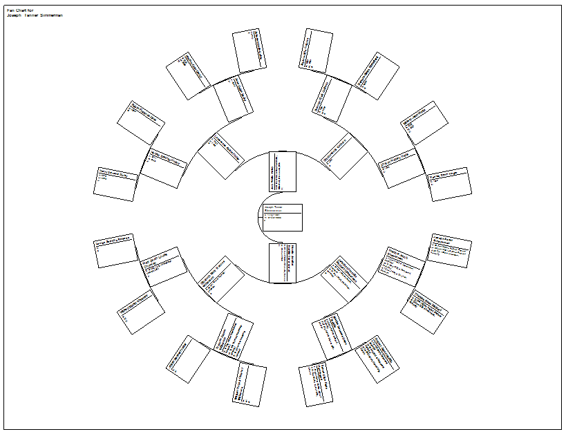
Following is a screen shot of a default Fan Chart.
Above is a four generation Fan Chart using a 360 degree spread.
Chart Title Control
See Pedigree Chart: Chart Title Control
Layout Control
“Poster” layout is the only layout available for the Fan Chart.
The “Advanced Layout” dialog is available for the Fan Chart.
The horizontal spacing control affects the Fan Chart more so than the vertical spacing control. I rarely change the vertical spacing.
Following is a screen shot of the “Advanced Layout” dialog where the horizontal spacing has been increased.
Spacing Control
The spacing control behaves in a similar manner as the spacing control for all chart types. “Perfect” spacing is greater than “Collapsed” spacing. “Collapsed” spacing is greater than “Squished” spacing.
See Hourglass Chart: Spacing Control.
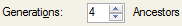
Generations Control
The Fan Chart displays only ancestors.
See Vertical Pedigree Chart: Generations Control.
Background Control
See Pedigree Chart: Background Control
Pictures Control
See Pedigree Chart: Pictures Control
“Checkbox” Options
The “Checkbox” options are the group of options below the divider line and above the “Generate Chart” button.
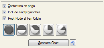
The Fan Chart checkbox options are:
Center tree on page
Include empty branches
Root Node at Fan Origin
“Center tree on page” and “Include empty branches” are the same as for other charts.
See Pedigree Chart: “Checkbox” Options for “Poster” Layout.
“Root Node at Fan Origin” Check Box
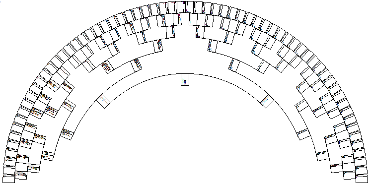
This means keep the root node at the origin of the chart. In a 360 degree chart this would be in the center. In a 180 degree chart this would be aligned along the bottom and in the middle.
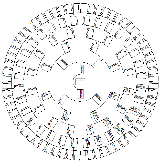
Following is a screen shot of a 360 degree chart with the root node at the fan origin.
Following is a screen shot of a 180 degree Fan chart with the root node at the fan origin.
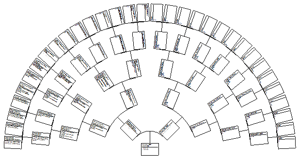
If the checkbox “Root node at Fan Origin” is unchecked the root node and all other nodes move outward towards the edge of the chart resulting in the generations being tightly spaced.
Following is a screen chart of a 360 degree fan chart with the root node not at the fan origin.
Following is a screenshot of a 180 degree Fan Chart with the root node not at the fan origin.
Notice the difference in the charts when the root node is at the fan chart origin and when it is not.
Fan Angle Selector
Along with the check boxes the Fan Chart has a “Fan Angle Selector”. These are “radio” buttons.
 360 Degree
 180 Degree
 135 Degree
 90 Degree
 45 Degree
And below is a 45 degree Fan chart with the root node not at the fan origin.
Generate Chart Button
See Pedigree Chart: Generate Chart Button
Person Locator
See Pedigree Chart: Person Locator
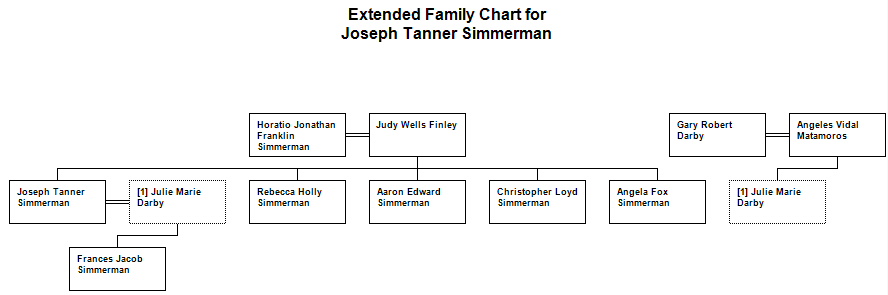
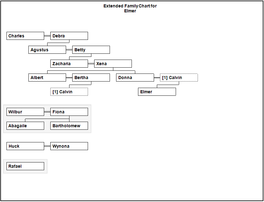
Extended Family Chart
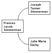
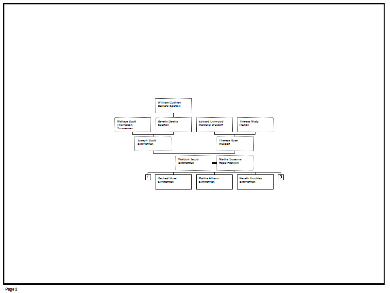
The Extended Family Chart displays a root person and all their relations and their spouses with all of their relations. The chart maintains all generations relative to the root person aligned horizontally.
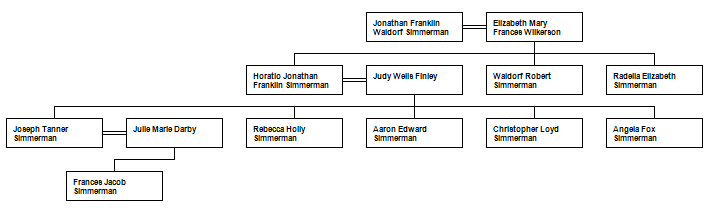
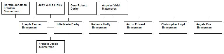
Following is a comparison of the Extended Family Chart and the Hourglass Chart.
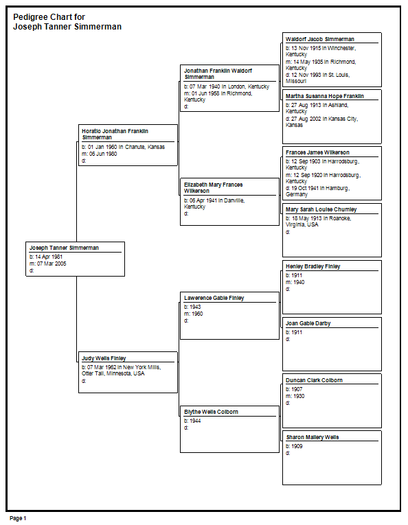
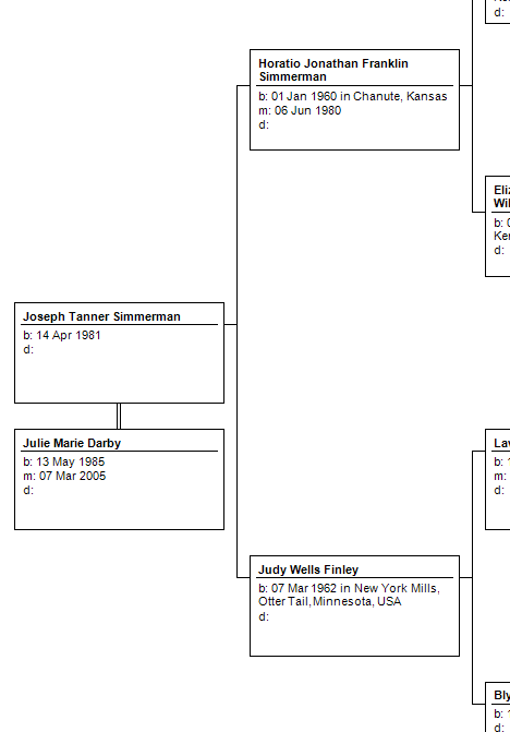
Below is a screen shot of an Extended Family Chart.
Following is a screen shot of an Hourglass Chart.
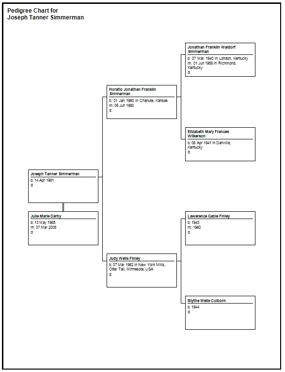
Both charts are 1x1 which mean one generation of ancestors and one generation of descendants. To make the Hourglass chart as similar as possible to the Extended Family Chart it includes spouses and siblings of the primary individual.
Notice the spouse of “Joseph Tanner Simmerman”, “Julie Marie Darby”. In the Extended Family Chart Julie’s parents are included and they are not included in the Hourglass Chart.
The Extended Family Chart will load the ancestors and descendants specified for everyone in the chart.
Imagine the Hourglass Chart including the parents of Julie.
The connecting bracket line from Julie to her parents would overlap and intersect other bracket lines. Therefore the Extended Family Chart duplicates Julie’s node and places the duplicate on the same generation aligned vertically with the original node.
Notice that Julie’s node has a [1] in the top left next to her name. This indicates that the node was the first node duplicated in the chart. It is not an “ID” number nor is it a count of how many times the node is duplicated.
Following is a screen shot of the options for the Extended Family Chart.
Chart Title Control
See Pedigree Chart: Chart Title Control
Layout Control
There is only “Poster” layout and there is no “Advanced Layout” for the Extended Family Chart.
Spacing Control
Spacing refers to the space between the person node boxes. There is horizontal and vertical separation or space between every node and ever generation of nodes.
The default spacing for the Extended Family Chart is “perfect”. In this case “perfect” means more than “collapsed” and “collapsed” means more than “squished”.
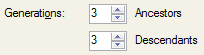
Generations Control
The Generations Control behaves the same as it does for the other chart types that included ancestors and descendants.
See Horizontal Hourglass Chart: Generations Control.
There is no checkbox option for “Include empty branches” therefore in this aspect the Extended Family Chart differs from the Horizontal Hourglass Chart and Hourglass Chart.
Background Control
See Pedigree Chart: Background Control
Pictures Control
See Pedigree Chart: Pictures Control
“Checkbox” Options
The “Checkbox” options are the group of options below the divider line and above the “Generate Chart” button.
The checkbox options for the Extended Family Chart are:
“Center tree on page” and “Boxes overlap page breaks” are similar in all chart types.
See Pedigree Chart: “Checkbox” Options “Poster” Layout.
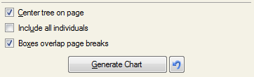
“Include all individuals” shows everyone in the database.
Since the charts can be very large when everyone is included the following screen shots are from a small database.
This database has individuals that are not related to the root person “Elmer”. These unrelated groups of people are included in the Extended Family Chart. They appear below the nodes of Elmer’s chart with an alternating background rectangle to help visually identify these separate individuals.
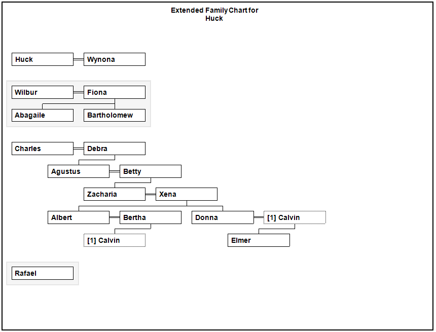
If the root person of the Extended Family Chart is “Huck” with all individuals included then the chart appears as follows.
Generate Chart Button
See Pedigree Chart: Generate Chart Button
Person Locator
See Pedigree Chart: Person Locator
I invented the Person Locator control while I was developing the Extended Family Chart. I needed a way to find persons in the chart and scrolling around and searching manually was very frustrating.
Saved Charts
Creating a Saved Chart
Any chart type can be saved.
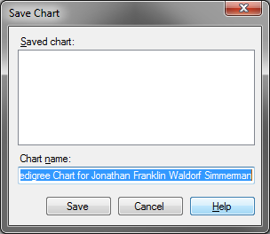
 This button opens the Save Chart dialog.
Opening a Saved Chart
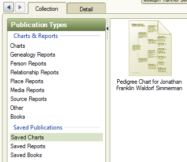
A saved chart can be found and opened by switching to the “Collection View” and selecting “Saved Charts”.
To open the saved chart just select it and “double click” or select “Open Chart” from the right panel or simply click on the “Detail” tab or use the “popup menu item”.
Following is a screen shot of the right panel.
Following is a screen shot showing the “Detail” tab.
Screen shot of the “popup” menu for saved charts.
Deleting a Saved Chart
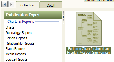
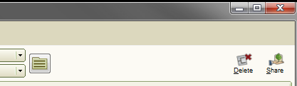
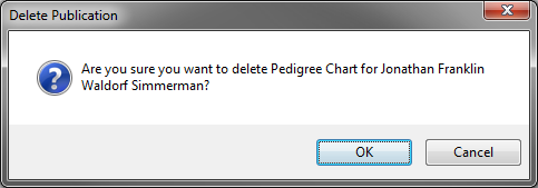
After selecting a saved chart in the “Collection” view you can delete the chart by clicking the “Delete” button in the upper right, by pressing the “Delete” key, or through the popup menu.
Screen shot of the Delete button.
Once the delete command has been issued a confirmation dialog is shown.
Renaming a Saved Chart
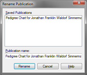
To rename a saved chart select it in the collection view and bring up the popup menu and select “Rename Item”.
Once the rename command has been issued the following dialog is shown.
How Saved Charts Work
Saved charts may behave differently than expected. A saved chart is made up of the following:
Chart Options Settings
Page Settings (from Page Setup Dialog)
Root Person
Box setting for each person in chart. (This gives size, location, and markings.)
List of included items
List of font options
A saved chart is not a copy of the data. What this means if you save a chart for a person and the chart includes the birth fact and you later modify the birth fact the next time you open the saved chart it will have the modified birth fact.
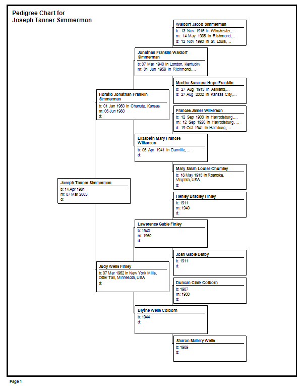
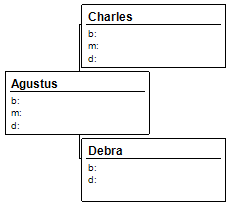
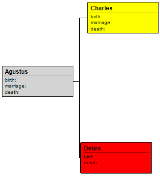
Following is a screen shot of a saved Pedigree chart. It is important to note that the number of generations saved for this chart is four and it does not include empty branches.
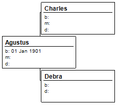
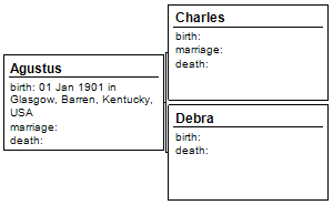
After saving the chart I switched to the “People” Module and added a birth date to Agustus. Then I switch back to the “Publish” model and open the saved chart. Following is a screen shot showing that the saved chart now included the birth fact information.
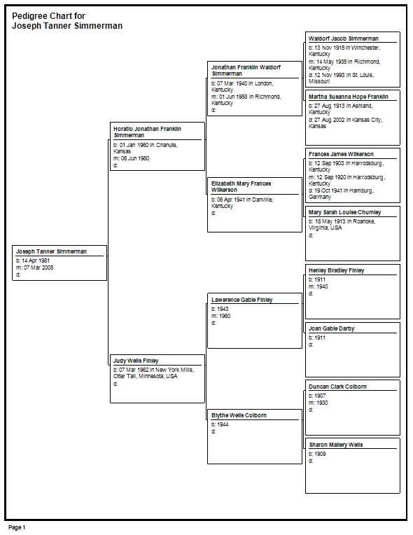
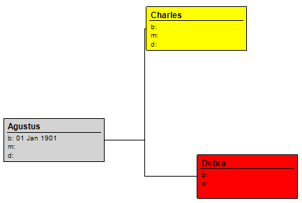
Following is a screen shot of the same chart with the nodes moved and marked. The chart was saved as a new chart.
Then I went to the “People” module and added a birth fact for Charles. Then I went back to the “Publish” module and went to the saved charts and opened the chart again. Here is a screen shot.
Note that Charles has the updated birth information and the nodes retained their positioning and their markings.
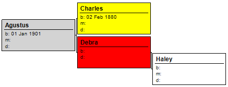
Remember that these saved Pedigree charts have the setting of four generations and not to include empty branches.
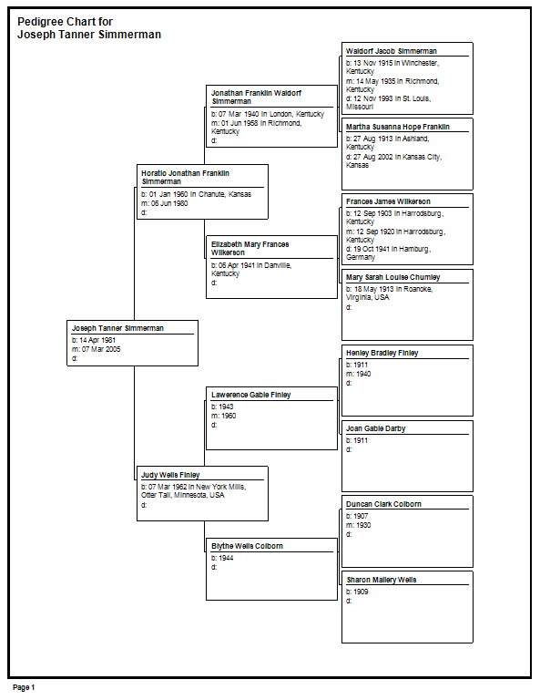
Now I will add a parent to Debra. I added a mother named Haley.
Going back to the “Publish” module and opening the saved chart the results are shown below.
The positioning information could not be restored because there are more nodes than when the chart was saved.
Recall a saved chart is made up of the following:
Chart Options Settings
Page Settings (from Page Setup Dialog)
Root Person
Box setting for each person in chart. (This gives size, location, and markings.)
List of included items
List of font options
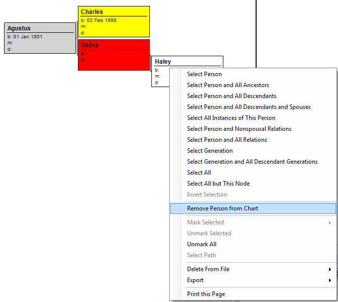
In the case of this saved chart the chart option’s generations is set to four. When the saved chart is opened it starts with the root person and loads four generations. This will include Haley. When the box settings are loaded it is noticed that there are more persons in the chart than there are box settings saved. Therefore the box settings are ignored and the chart returns to its original layout. Maybe I do not want Haley in the chart. So, I click on Haley and bring up the popup menu and select “Remove Person from Chart”.
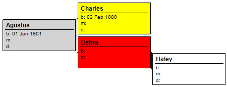
Then I move the nodes around and save the chart with a new name.
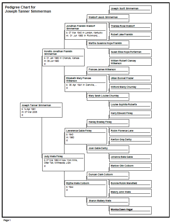
I go to the saved charts and open this newly saved chart and it is not what I wanted. Following is a screen shot.
Haley is back in the chart. I thought I removed this person from the chart. What is going on here?
Removing a person from a chart does not remove the person from the database. Since charts always load from the database so that the chart displays the current and correct data the chart will include anyone that was removed when the cart is reloaded. There are many actions that can cause a chart to reload. I only use “remove person from chart” when I am about to print the chart or save the chart as an image or PDF.
The Extended Family Chart is affected most by the addition of a person to the database. Extended Family Charts load in such a manner that if any new person is added the markings, sizes, and locations are reset. I am only stating how it works and I am not stating that this is ideal.
If a fact is added that is large enough to cause wrapping then saved charts are affected.
Here is a screen shot of a saved chart.
The included item’s options are set to full labels, include place, description, etc…
Going to the people module and adding a birth fact for Agustus that includes place information results in the following chart when the saved chart is reopened.
Notice that the position and sizes are restored. However the box for Agustus is not tall enough to show all of the facts.
Clicking the “Generate Chart” button will regenerate the chart, but will lose the positions and markings. However the box is now large enough to show all of the facts.